
Get inspired with these 10 beautifully designed event website examples.
Often the event website is an attendee’s first encounter with an event.
An event website can cause the first rumblings of hype (or dread). It can drive event registration or abandonment. The web designer’s job is to master the event’s aura before the event even happens, capturing the scene in fonts, colors, and design.
These websites show us, uniquely, how to mold an event’s esthetic into something digestible, useful, and that accurately reflects an event’s story. Each person has a story, product, and business has a story—and so does each event.
Whether you’re capitalizing on virtual events or gearing up for the return of in-person events, you can use these event website examples to inspire your own.
An event website acts as the storyteller and, if the story seems consistent and cool, then people will want to experience the story for themselves and attend the event.
Here are the best and most beautiful event websites that function as great storytellers (in no particular order):
1. Outreach Unleash

With Outreach’s 2021 virtual Unleash conference already behind us, the sales engagement company is gearing up for a return to in-person in early 2022. To engage both customers and prospects, Outreach put up a kind of “save the date” event page—simple, colorful and clearly exciting for what’s to come.
2. Vanity Fair’s Cocktail Hour

Vanity Fair held a classy event with classy speakers—and created a classy event website to match. With a muted color palette, unique fonts and a minimal look, the site looks more like a Coachella poster than an event page (and we mean that in a good way). We look forward to future iterations.
3. Snowflake Summit

Snowflake—the data platform company that made data platform companies cool—boasts a crystal clear, technological theme. It’s not only the style that makes things clear: the minimal messaging means visitors understand the benefit of the event (lots of sessions, even more attendees) right off the bat. We like the added touch of calling out the 2022 event as a CTA on the event page, too.
4. Grow with HubSpot

HubSpot’s brand is unmistakable, and the event website for its series of GROW events are no exception. Simple navigation across the top, clear calls-to-action and the front-and-center brand made this an effective event website for the company. HubSpot is now using the same registration page for its replays via the Premium Pass.
5. Brand New Conference

Even as a ‘placeholder’ event website, the Brand New Conference site is eye catching. Brand New has a history of heavily themed events (and event promo assets)—a few years back, it used a bitmap-oriented theme, reminiscent the early 1984 Mac OS. This year, it goes Western as the conference heads to Austin in 2022.
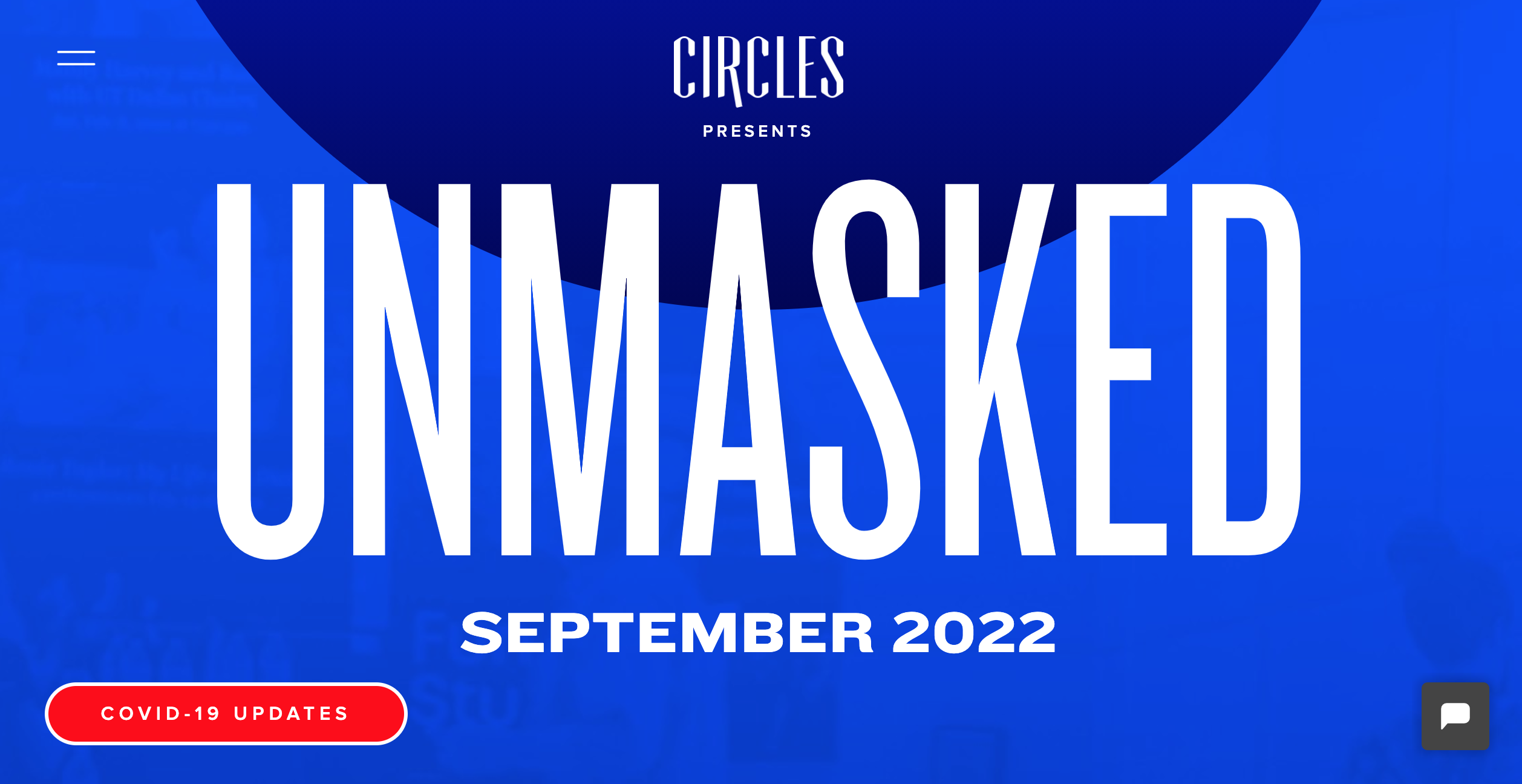
6. Circles Conference

This year, the Circles Conference goes bold with its event website—both in design and theme. Called “Unmasked” and slated for September 2022, the meaning behind this upcoming event is unmistakable as we start to put COVID-19 behind us. For an event that’s still more than a year away, this event website goes out of its way to get potential attendees excited.
7. Branch.io: Branchout

Not all event websites need to be flashy with impressive graphics. More than anything, the website has to resonate with the target audience and align with the event vision. Because Branchout is a conference focused on specific technical topics such as mobile fragmentation and cross-platform user experiences, the event website skips the fluff and gets straight to the point. By providing all of the previous year’s event content on the homepage, this event website is a great example of designing with audience in mind.
8. Google I/O

Though Google I/O’s brand name alone is enough to pull anyone into their event website, they still took much time designing a stellar website experience. Having an eye-catching countdown clock as soon as you enter the page helps to build up anticipation for the event. The weather widget overlaid on top of a beautiful image of the previous year’s outdoor keynote session also does well to generate enthusiasm because attendees can expect to have similar great weather for this year’s event.
9. Blockchain Nation: Miami

Sometimes the best design can come from the actual event setting. Since this blockchain conference takes place a beautiful beach city, the website takes advantage of this by including a breathtaking skyline image of Miami. The image goes will with the event brand colors as well, creating a visual harmony while still making the CTA button stand out.
10. Insurection

While the company putting on the event surely has its own brand, the event itself should have a standalone brand as well. In the case of Insurection, the industry event put on by the French insurance company April Group, the conference does well to stay in line with the overall April Group brand while also bringing its own aesthetic. The eye catching header banner with a diverse palette of colors and shapes makes the event homepage memorable for anyone who visits. Making sure that your event brand stands out through distinct visual elements will help it to stay top of mind of attendees.
Key Takeaways
These examples all exhibit strong qualities that can be replicated and implemented into your own event website. Though there a countless tips we can take from these examples, here are some of those tips distilled into key event marketing takeaways:
- Make sure that your website colors, fonts, and visuals overall represent and cohesive and unique event brand that will be memorable to anyone who visits the site.
- Less is more. Be efficient with the amount of words on the home page and let the design do the talking.
- Keep your target audience in mind and make sure their questions and concerns will be addressed directly in the design/layout of the event website
- Use images or videos from previous events as the homepage banner to have your website visitors envision themselves at your event.
- Make sure the most important event details (date, time, venue) are viewable as soon as someone visits the event website
Mixing and matching the different tips and takeaways from this list of beautifully designed event websites will help you to create the perfect visual representation of your unique event.
You may also be interested in:
For more awesome event resources, click the button below. Your brain will thank you.
Click here to see original post